Unrealized promise of strategy maps
When asked, “what is the most powerful tool in the strategist's toolkit?”, I immediately answer “a Strategy Map.” I provide the same answer to “what is the most poorly used tool?”
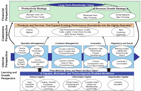
Popularized in the mid-1990s by Balanced Scorecard co-creators Drs. Robert Kaplan and David Norton, the Strategy Map emerged when early scorecard pioneers such as Cigna Property & Casualty and Mobil Oil found it valuable to separate out the objective dimension of the Balanced Scorecard framework to lay out a cause-and-effect relationship between the objectives housed within the four perspectives: typically enablers (learning & growth and internal process) and outcomes (customer and financial). Originally called “Linkage Models,” the idea of the Strategy Map was born.
Dr. David Norton has said that, “The idea of the Strategy Map was as important an insight as the original Balanced Scorecard framework.” Indeed, it transformed the Balanced Scorecard system from a “balanced,” measurement system to a full-fledged strategy execution model.
The value of cause and effect
Note the value identified by the pioneers was in laying out a cause-and-effect relationship; thus, understanding how progress to one or more enabler objectives delivered the desired outcomes. Sadly, most Strategy Maps that I have reviewed over the past 20 years or so have, in practice, not been about cause-and-effect (or at best no more than at a perfunctory level), but simply plotting a group of objectives against each of the perspectives. Nothing more than a more visually appealing way of providing a list.
That said, displaying objectives that are at least casually (if not causally) “mapped,” on a single page is itself a useful strategy communication mechanism. And this is precisely how a Strategy Map is used by most firms.
Telling the story
When reviewing Strategy Maps, I ask leaders to explain their hypothesis as to how improvements to a learning and growth objective will eventually deliver financial (or stakeholder) outcomes. I simply say, “explain it to me – I don’t understand.” Normally the answers are somewhat vague and hesitant. I will then ask for a written description of the causal relationship. If the map is collocated per strategic themes (as examples, customer focus, operational excellence and innovation) I will ask for a description at the theme level. This strategic performance narrative proves a powerful mechanism for leaders to gain a better understanding of their hypothesis and the causal assumptions (and keep in mind that a strategy is not a statement of facts, but a set of assumptions that must be confirmed through execution).
…keep in mind that a strategy is not a statement of facts, but a set of assumptions that must be confirmed through execution
Objective statements
To build a more robust narrative, I place attention onto the objective statements that provide a fuller description of the objectives on the map (which due to the constraints of space are limited to a few words). At the outcome levels, the description details (typically in a single paragraph) what the objective will look like if achieved. At the enabler levels, it explains why the objective is strategically important (how it delivers outcomes) and how this will be achieved (what needs to be done) and two paragraphs will suffice.
By weaving these objective statements into a single narrative, the story of the why’s and how’s of the strategy is told. Furthermore, this narrative serves another useful strategy communication vehicle, delivering the detail and context that by necessity is absent within the Strategy Map. Many people like to know the specifics.
By weaving these objective statements into a single narrative, the story of the why’s and how’s of the strategy is told.
The narrative also triggers a more precise identification of the Key Performance Indicators (KPIs), initiatives and strategic process improvements required to deliver to the strategy. This might be identified via the application of driver based models for each objective.
Causality within KPIs
However, a word of caution. If organizations are generally poor at understanding cause and effect between objectives, they are typically even less adept at visualizing the causal relationship between KPIs. Simply put, an outcome KPI is only achieved by delivering to enabler KPIs. This is why strategic initiatives and process improvement are hardwired to the enabler, rather than outcome levels.
As with objectives, when choosing KPIs it’s important to begin with the financials and then work downwards. How would the customer KPI deliver those at the financial level? How would the internal process measures deliver those within the customer perspective? And finally the relationship between learning and growth and internal process? The cause and effect hypothesis is fully understood – and measurable.
Testing cause and effect
With all this in place the stage is set for proper testing and analysis of the hypothesis, as described within the Strategy Map and Balanced Scorecard. Historically, cause and effect analysis has not been a standard practice of most scorecard users. The “arrows” placed on Maps are rarely validated.
Historically, cause and effect analysis has not been a standard practice of most scorecard users.
To be fair, there are good reasons why causality has hitherto not been afforded the required attention. We simply did not have the organizational capabilities (people skills and software) to do this work. Or rather, it could be done by hiring a boat-load of very expensive statisticians. Rarely feasible. Advanced data analytics make this task relatively straightforward and financially viable.
The application of data analytics (descriptive, predictive and prescriptive) delivers invaluable insights into how movements against KPI targets are impacting others (indeed will help identify which drivers of the KPI are the most impactful and so better target scarce resources) and from that confirmation (or not) of the hypothesis about the relationship between objectives. Also gathered is useful information on the impact of initiatives and process improvements on the KPIs and therefore objectives. Based on the data, interventions can be strengthened or changed as appropriate.
Parting words
Perhaps for the first time since Strategy Maps were introduced to the strategist’s toolkit, we are finally able to realize the promise of the map – to describe, manage and test cause and effect. As Dr. Norton has said, this represents the next evolution of the Balanced Scorecard system.
_____________________________________________________________________________________________________________
As always feedback is welcomed.

Comments
No comments currently.